Friday, March 15, 2024

NightCafe AI art

 I spend a lot of time on NightCafe these days making art using AI.

There are Daily Challenges which the first three of these images came from:


This underwater horsey one was prompted in Welsh by using Google Translate to translate the prompt from a previous image into Welsh.

This was the original:


There are lots of games to play and it is a very sociable place to be.

If you'd like to see more of my work use this link.


Monday, January 23, 2017

Sunday Postcard - Circles & Other Challenges


Hello dear blog - long time, no see...

Over the last two years or so I've been mostly working in art journals and keeping what I've done private. Now it feels like time to come out of my shell once more and share a little...

In the last week I've made my first ever YouTube videos - these first three are all in response to challenges set by others.

Pick-a-Stick Challenge - January 2017 #PASC0117

The idea of the challenge is that each month 10 sticks are pulled from a bunch - each includes a suggestion for how to work on an art journal page. There is also a wild card which one can choose to use instead of any one of the other sticks.

If you would like to join in there is a FaceBook group set up to host the challenge. 

My video is here.

Mission Inspiration - January 2017


Similarly a challenge with specified steps, though this time also a suggested colour palette and some words to suggest a theme.

The FaceBook group is here.

My video response is here.


Sunday Postcard Art

The third video is an experiment in time lapse using the app Lapse It. This challenge is set via a blog - Sunday Postcard Art. It was set by one of the YouTubers I've been following recently - Jopke.

My video (all 21 seconds of it) is here.  


I used a couple of sheets of watercolour paper that I had previously painted to doodle on - one of which did indeed have doodles on. I cut circles out of both then added swapped them around.

Most of my journalling is done using watercolours and collage. I buy all my watercolours from Jacksons so I'm glad to see they have an offer on at the moment! (Only until 7 Feb 2017).

If you have never shopped with them before you can also take advantage of an additional 10% off whatever you buy by going via this link: First Time Shopper.

Please let me know if this works for you!


Sunday, April 19, 2015

Blowing bubbles

I've been blowing bubbles with Jackson's Indian Ink on paper and encaustic:


I would never have tried this with previous indian inks as they are relatively expensive - the Jackson's Indian Ink is however very economical and comes in a large bottle making it easy to play with. Though its success did lead me to try some of my more expensive ones too...

The key to getting good bubbles is to use a decent detergent - the only one that I've found that does work available here in the UK is the original form of Fairy Liquid. You will also need to add water and ink. Experimenting with the quantities is part of the fun - start off with minimal water and add more if you think you need it.

Use a straw to blow the bubbles and make sure you only ever put the non-inky end in your mouth! I put a little piece of masking tape on mine with an arrow to show which way was up.

I tried several different ways of working with the bubbles - the best was putting them into a very shallow tray and blowing the bubbles big enough that they were over the edge of the container and I could "print" them onto paper without touching the edges of the dish.

Update 10 August 2016: Please note that the link to the ink will take you to Jackson's where you can buy this ink and in the process donate a few pence to me too!

If you have never shopped at Jackson's get a 10% first order discount using this link.

Saturday, January 17, 2015

Year of the Spark

Hello!

My 2012-2014 were spent selling, renting and finally buying a house (with a separate studio - yippee!)... during all this upheaval my poor blog lay fallow... now for some art on line again!

2015 is the Year of the Spark - being lead/taught by Carla Sonheim and Lynn Whipple... just what I need to get me back to posting.The class is very active on FB but I will be posting my longer contributions here...

I took an Art of Silliness class with Carla in 2011 - the only blog post I have to show for that is here.

Carla's first lesson this year should have been easy for someone who'd previously drawn along with her... however for some reason my left hand absolutely insisted on drawing at the same time as my right hand...

I have a big pad that I often sit with on my lap and doodle in when Jim has the TV on... previous pages have been covered quite happily using just my right hand to draw, for instance this was a pre-Christmas page, whilst I was working on our Christmas Card - see my only blog post from last year for the final Christmas Cracker Card.

Christmas Doodles
Pre-Christmas - drawings using right hand

Here are a couple from my big book drawing with both hands - actually the bit that made me laugh most as I did this was attempting to write the date at the top - IT was a bit hit and miss... and yes that's the clue to why I carried on and in fact let both hands draw together for hours on end - it made me laugh!

Animals drawn side-by-side simultaneously with left and right hand  Vases of flowers drawn side-by-side simultaneously with left and right hand

Rock art white on black drawn with left hand whilst drawing... Rock art drawn in black pen on white paper with right hand

Using colour to re-interpret one of the figures drawn previously


Saturday, December 13, 2014

Crackers For Christmas


 One of the things I associate most with Christmas Dinner is the pulling of crackers - after they've been snapped comes the random assignment of funny little gifts - the donning of paper hats that don't quite fit and of course the reading out of bad jokes.

I love the fact that the gifts are random but the quality of the gifts in bought crackers is never very good so if you want to do something about that the best solution is to make your own crackers.


Next stage is to undo them, pop the snap into the cracker along with paper hat (not shown), joke and gift. Reform and tie with ribbons.


I followed the instructions here.

The traditional way to pull the crackers goes like this:
  1. Stand or sit in a circle.Everyone has one cracker.
  2. Hold the cracker in your right hand - you may want to hold onto the snap just to make sure it cracks.
  3. Cross your arms and with your left hand hold on tight to your neighbours cracker.
  4. One, two, three - Crack! Everyone pulls their crackers together.
  5. Anyone left holding more than one body of cracker - maybe still containing bits hands that to someone without one.
  6. Scrabble around on the floor looking for gifts that fell out during the crack.
  7. Put on your paper hat.
  8. Take it in turns to read out the jokes.
  9. Play with the gifts - or wear them - swap them - or carefully hide amongst the paper rubbish...

Update: This was my final version - I used it as a Christmas card that could be made into a cracker:


Thursday, January 12, 2012

R&F Encaustics Arrive!


This morning I saw a bright red van promising "the most fun kids can have" and as I was taking a photo of it I happened to also get a yellow house and a blue car in the picture too... three primaries converging...  it felt like a good start to the day that I was expecting my encaustic paints to arrive!

When I got home a delivery van was just leaving... but that turned out to have been bringing Teasel's next 5 month supply of kibble!

I had to wait a little longer for my parcel....

I'd been taking ages to decide on what to order or indeed whether to order at all... but a few things helped me make up my mind...
  • I discovered that the current prices on the R&F website were, when changed into £s, now much the same as the current prices from Jacksons.... that I would also be likely to be charged  20% Import VAT, plus postage, plus maybe another £10 to the carrier for the pleasure of having them collect customs duty from me!(Thanks Ros for warning me about that £10).
  • From Jacksons Facebook page I knew that their prices were very likely to be going up as soon as their new catalogue comes out soon...
  • And finally in my fantasy ordering at one point I accidentally put in two of one colour and got a message that they didn't have enough in stock to meet the whole order... whereas with just the one it had been okay... when it said "low stock" it really meant it...
I also discovered that when Jacksons show "special offers just for you" under the shopping basket they can indeed be bargains... the only one that interested me was for some angled Hakes... I got three for the price I've paid before for one!

I also ordered a couple of R&F pigment sticks to see what they are like - here are the Hakes and few of my new goodies:


Sunday, January 08, 2012

Avoid Alizarin Crimson!


Over time we expect a rose to fade... we do not expect the same from our paintings!

In my previous post I gave two examples of colour palettes: one from Arthur Stern (for oil paints) and the other from Michael Wilcox (for watercolours)... both were focussed on choosing paints that will mix well... both palettes included Alizarin Crimson.... however, on a little further investigation, it turns out that this is really a pigment to avoid, especially in colour mixes!

I was looking at the R&F encaustics information about individual colours and here is what it says about Alizarin Crimson: "Not sufficiently light-fast in tints."

This rang an overdue alarm bell for me!

I looked at Winsor &Newton's information about their Artist's Quality oil colours and found this:
Of the 120 colours in the range, 119 are now classed as 'permanent for artists' use' [AA or A ratings from Winsor & Newton] which aids in the longevity of paintings. Although Alizarin Crimson is only given a "B" rating ( moderately durable), it has been part of Artists' Oil Colour for over 130 years and is still considered a key colour by many contemporary artists.  
But knowing myself and how long its taken me to get around to reading the boring stuff about permanence etc I don't think that artists are expecting any "Artists' Oil Colour" to fade... so the fact that so many consider it a key colour is only through ignorance of its properties....

Before Christmas I bought several Artist's Quality oil colours from several different manufacturers to make homemade encaustic paints... I was looking at the data sheets to check on opacity and translucency which is something I think matters a lot in encaustics. Somehow one of the paints I bought, Carmine Deep (an expensive one too!) has turned out to be non-permanent... my excuse is that as it was from Sennelier the data sheet was in French... but the real reason was that I did not expect a series 3 oil paint from a reputable paint manufacturer to be unsuitable for use in art!

I'm even more shocked that Micahel Wilcox recommended Alizarin Crimson in Blue and Yellow Don't make Green (1989 edition)... though it looks as though more recent editions avoid it... I now have his later book "The Artist's Guide to Selecting Colours" (1997) bought direct from his website - The School of Colour - (thanks to Sue for telling me about this website). In this book he has clearly done his research on permanence and not just mixing.... he says Alizarin Crimson PR 83:1  "has failed all lightfast testing in all media"... in particular it fades when used thinly or when mixed with white....

Okay so R&F alerted me to this, what do the other encaustic paint manufacturers say?

Enkaustikos do not give a plain English warning... to find out the truth you need to look at their codes: "Alizarin Crimson Pigment Color Index name  PR83 - III"

So that III is the clue... I = Excellent lightfastedness, II = Good and III = Poor.... who really wants to buy a colour, no matter how beautiful if in a few years time its going to fade? Especially if it is beautiful!

And its the only paint they have marked as being a III....


The major UK encaustic paint maker does not give the pigment numbers though there are pigment names... They use a different scale of lightfastness... and I'm pleased to say they are not offering anything called Alizarin Crimson at all.

 The lightfastness scale they use has 5 = excellent, 4 = very good, 3 = good and they say they do not offer anything with a worse lightfastness than 3... also after a quick look the ones only rated 3 are neons + pastel cream... 

But there is a general warning that adding whites to colours may make them prone to fading... which, as it is given as a general warning, apparently applies to all their colours... and therefore makes them all useless to me.

Sigh... I'd love to be able to buy the local colours... but I don't want to spend money on any paints to which I cannot add white... I may not want to add it all the time but sometimes I do!


And what about making my own encaustic paint directly with pigments?

I now understand a tiny bit more about paint making... enough to know that paint makers do rather more than just throw in some pigment and stir it around a bit... which is all I'd be able to do.... whether that matters when the medium is encaustic I don't know...

Wednesday, January 04, 2012

How to see Colour and Paint it


I'm wondering about what colours to buy for encaustic painting... indeed I'm beginning to worry that I may have to make my own colours using pigments...

Sometime in the 80s I got Arthur Stern's "How to see Color and paint it" (now sadly out of print Update: It was republished in 2015 with a different cover but same content - still only available in print so far as I know). I worked through many of the exercises at the time... but I don't seem to have kept any of the still lives (in oil) that I painted... the greatest tool in the book was what he called a spot screen - to make one cut out a 2" x 4" piece of neutral grey card - I use the backs of old sketchbooks - and punch a small round hole centrally about 1" from one one end:


Spot Screen held at arm's length


You use it to observe what a colour really is rather than what it appears to be when seen in context.

To do this hold the spot screen at arms length, close one eye and half-close the other - look through the hole in the spot screen at the colour area you want to match - name it - he uses a system based on the colour wheel and one that I've used ever since - red, red-orange, orange, yellow-orange, yellow, etc...., its luminosity that is light, medium or dark, and its saturation e.g. bright, middling, dull... then of course if one is painting one mixes a colour to match what one has observed... but what is so illuminating is that one looks at something one would say was obviously red, then when looking through the spot screen it turns out to be a shade of blue!

Which is all a lovely diversion from what I'm really looking for today... I want a palette of colours that I know how to use and that will give me the whole range of colours I've been used to paint in... which is why I originally got this book off the shelf...

Stern's oil colour palette suggestion is:
  • Alizarin crimson (see warning below)
  • Cadmium red light
  • Cadmium orange
  • Cadmium yellow pale
  • Phthalocyanine green
  • Phthalocyanine blue
  • Ultramarine blue
  • Titanium white
For me now there is a huge over-reliance here on cadmium... I would prefer to avoid cadmium... I may end up with a little in my palette but really its a substance that I'd prefer not to be a consumer of... in any sense...


Another book with a similar take on the mixing of colours is Michael Wilcox's "Blue and Yellow don't make Green"... though it doesn't have that great spot finder tool in it...  it does go into great detail about how colours work... he also covers transparency and permanence which are important aspects of pigments though in his examples he uses a lot of cadmiums too... his principle however is to have a warm and cool version of red, blue and yellow which is what I've always aimed to have since doing Stern's exercises.

BTW the pedant in me has always wanted to change Wilcox's title to "Violet-Blue mixed with Orange-Red doesn't make bright pure Green".... though I realise that lacks a certain punch!

Wilcox's suggested palette is:
  • Orange-biased red - Cadmuim red
  • Violet-biased red - Alizarin Crimson (see warning below)
  • Green-biased blue - Cerulean Blue
  • Violet-biased blue - French Ultramarine
  • Orange-biased yellow - Cadmium yellow pale
  • Green-biased yellow - Lemon yellow (Arylide yellow preferred, otherwise he suggests cadmium or barium).
He specifically excludes the strong staining colours... so now I'm wondering if in fact one of the things I might benefit from is strong staining pigments... you see the problem is that colour mixing is not the only consideration... pigments have all sorts of other attributes apart from colour.... of course how they mix with other colours matters but also how transparent / opaque are they? How permanent? Good for staining? Glazing? and so on... no wonder I end up wanting the whole shop!

Doing a virtual shop from R&F for encaustic paints:
  • Orange-biased red - unfortunately the most obvious choice is Cadmium Red Medium, though an orange-red that looks worth playing with instead is Alizarin-orange, if one could cope without the sheer redness of the cadmium... also worth a look is Rose Madder... which is the one I like the look of most but there is a warning about it not being light fast in tints...so not suitable as the only orange-biased red in one's palette...
  • Violet-biased red - Quinacridone Red... 
  • Green-biased blue - Phthalo Blue... 
  • Violet-biased blue - Ultramarine Blue
  • Orange-biased yellow - hard to avoid the Cadmium Yellow medium here... though Indian Yellow (quite orange looking) might be worth using
  • Green-biased yellow - Cobalt Yellow
I don't seem to be much closer to choosing which encaustic paints to buy...

I would like to know which pigments people have had most success using to make their own, Judy demonstrated using Titanium White for instance... anyone have any other really good choices for home made paints?

Update: Warning about Alizarin Crimson - see next post - Avoid Alizarin Crimson!

    Sunday, January 01, 2012

    Encaustics in the UK

    Ammonite (detail) in encaustic by Caroline
    In 2011 I began to paint in encaustic. I took Judy Wise's on-line class in Hot Wax, which ran for four weeks. There were new videos every weekday and a round-up of questions and answers on Saturdays. It was marvellously inspiring to see the new video each day and to wonder about experimenting with all the techniques. Quite a few of the techniques relied on materials that I prefer not to use, on personal health grounds, but it was good to see them in use anyway and gave me other ideas for how to work with wax.

    Indeed one of the reasons I wanted to work in encaustic was that I hoped I'd be able to cope with them better than acrylics to which I seem to have developed an intolerance... and although Judy suggested using oil paints with the wax there was no need for turps or other solvents.... heat is the wax's solvent.

    Judy and many of the participants are based in the US. This meant that I, and the few of us from the UK on the course, had to source our materials ourselves. I'll update this post (updated Aug 2016) with any new UK suppliers I find. (There were people from all over so we were not the only ones having to do our own sourcing - it was part of the fun!).


    Update Aug 2016: Its become difficult to get good beeswax. It is possible to buy R&F encaustic medium ready made from Jackson's.


    Making medium
    Medium cooling
    To start off one needs to make medium. Encaustic medium is generally made from a mixture of beeswax and damar resin (also known as damar gum... but NOT the same as damar varnish).

    Beeswax

    Suppliers of beeswax who have confirmed that their beeswax is filtered rather than chemically bleached (I have not been able to confirm with this one remaining supplier - Aug 2016)
    Damar Resin or Gum
    Suppliers of Damar Gum:
    To make medium one needs a heat source. I used a double boiler on a separate mini hob...  Lloytron E833wh Table Top Mini Hob.... I started out using a saucepan directly on the hob but now I use a double boiler - its safer... but slower! 


    There are several tutorials on how to make encaustic medium on the web for instance Andrew Gott's Making Encaustic Medium, Rick Green's Making Wax Medium, as well as recipes from books. Lissa Rankin's book Encaustic Art has a recipe based on 10 lbs of beeswax that takes more than a day to melt.... I've been making either 1 lb or 500 g of beeswax based batches and these have taken more like an hour.... 

    I used silicone moulds of various sorts to shape the wax. I found that some things sold as silicone moulds could not stand the heat and others were just too thin. My preferred moulds at this time are:
    One of the frustrations for the beginner is that everyone says that the amount of damar to beeswax is variable... for instance there is a great chart giving the ratios by weight and by volume.... though as I prefer to work in grams I made my own chart for the same ratios - if you click on it you should get a more readable version:


    Mostly I've used 8:1 as that seems to be a fairly standard starting point. If you need your medium to be harder you might go for 9:2 or even 4:1... whereas if you are working thinly on paper you might not add any damar at all...


    Another problem I have had is in filtering the medium. The damar tends to contain a lot of twiggy, dirty bits that need removing. Lots of different suggestions for filtering are out there but I've not found any entirely successful.... Judy recommends using paper paint filters but I've not been able to find any... my coffee filters didn't work.... the jelly bag melted when I accidentally touched it with the saucepan.... the local make-your-own-beer shop's muslins are too coarse and let lots of bits through.... the sieves I've used are also too coarse.... etc!

    At least the bits settle on the bottom so one can clean up the pieces of medium once its set.

     One of the hardest things to source was a suitable hot palette. Originally I got an Andrew James Teppanyaki Grill:


     Note the silver foil shielding the thermostatic "self-controller". My first thermostat failed after less than 6 weeks. They replaced it but said that as my use was "non-standard" they would not replace this one if it too failed. This was cramping my style as I was worried about it breaking...

    So I have now splurged on a vastly more expensive hot palette - the A2+ Encaustic Hotplate from encaustic.com. This is a German made catering warming plate that is meant to be good at maintaining constant, relatively low temperatures compared to the Teppankai grill which was made to cook things on. If you are in Germany this is the same model, though not specifically sold for encaustics....

    I have an anodised aluminium tray on top of the hotplate so that I can see what colours I'm using.


    Of course if I don't need an especially large hot palette then a frying pan on top of the mini hob is good too.

    I usually melt the wax on the grill before keeping it warm on the palette.

    In this country if you mention encaustic to someone, if they've heard of it at all, they will imagine you mean painting with an iron. Sometime ago I got a kit with an iron and some sticks of encaustic paint and the strange shiny card that is recommended to use with it:


    I find the iron uncomfortable to hold for long and I do not like the card so its not surprising that I have not taken to this style... though the paints smell lovely....  you can see my efforts on my Flickr stream here... I do know that many people love painting this way... its just not for me...  the iron doubles as a tiny hot palette if one just wants to mix a little colour...

    Colour... oh yes colour.... in the Hot Wax class Judy showed us how to mix medium with oil colours to make encaustic paints. Here is a colour wheel I did this way:


    I started off with a cheap set of oil paints (which I used for the above wheel) and since then have bought some more expensive highly pigmented good quality oil paints, especially ones with good transparency. In class we just added the oil paints to the medium (whilst it was melted) but quite a few people advise soaking out the linseed oil beforehand on paper towels (or other absorbent material). 

    There is a very big difference between using homemade colours and the ready-made ones. I only began to really appreciate this when I attempted to do some monotype prints (having watched Paula Rowlands wonderful DVD). My homemade paints, although they looked strongly coloured were full of medium and made the paper very wet and not very colourful whilst the bought sticks made very strong marks that transferred well to the paper:


    Encaustic paints available in the UK - the best are made in the US:
    • R&F - 80 are available in the UK from  Jacksons. R&F do ship to the UK but then there will be the possibility of customs duty to pay.
    • Hot Cakes made by Enkaustikos - some of their colours are currently available in the UK on amazon.co.uk... though with a high shipping cost so they may be being shipped from the US... if you are prepared to order from the US another source is the FineArtStor.

    Brushes... Its important to use non-synthetic bristles to avoid them melthing in the hot paint! Many people use cheap bristle brushes from hardware stores but I found some brushes I like a lot more:


    The big wide ones are Hakes and the others are white and black goat's hair brushes from Daler-Rowney mops. My local art shops had the Daler-Rowney mops on offer so I stocked up after finding I liked them. When full of wax they simply let the colours glide on - here is the underpainting I made using them before covering it up to carve out the ammonite shown at the top.


    Smaller brushes are useful when painting detail. Pick what you fancy but remember to use natural bristles.

    Here are two version of mistletoe that I painted for Christmas. I did my drawing on the computer so was able to print out multiple copies. The first I attached to a thick piece of ply, the second I mounted, once finished, behind a hole cut from a canvas so that it was supported but let the light through.

    In painting both of them I used encaustic as a resist for watercolour. The first one I then added pastels and more wax. The second one I left to show the translucency of the paper where it had been waxed. I was especially delighted that my green-gold paint was such a good mistletoe colour.

    Mistletoe mounted on plywood
    Mistletoe on paper mounted to let light through

    Depending on how one applies the encaustic to the support one may need to fuse the most recent layer to the ones below. I started out using an embossing heat gun... this was slow and noisy. After a week I got a gas blow torch from my local B&Q. It is great to use for fusing but I was slightly reacting to the gas... so back to an electric heat gun.... this time in the form of an old paint stripping heat gun:

    Gas blow torch
    Electric hot air guns
    I actually now use all three of these at different times. If applying the wax with an iron it may already be sufficiently fused... unless one uses it in my favourite way which is to melt the wax from a height and drip it! Then it needs further fusing... Similarly if one is using a heated stylus the wax should be fused as you go... but that's another tool I've not really got on with. My mother-in-law whilst here before Christmas much preferred it to all the other ways of working with wax we tried during her stay - she is used to using a dip pen and she loved this way of working.

    My favourite supports so far are the cradled plywood boards that Jim has been making for me. I also buy thicker pieces of plywood form my local hardware shop when they are in their remnant section... as I'm now interested in monotyping I'll have to expand my paper collection... but that is something for this year!

    Cradled plywood boards made by Jim
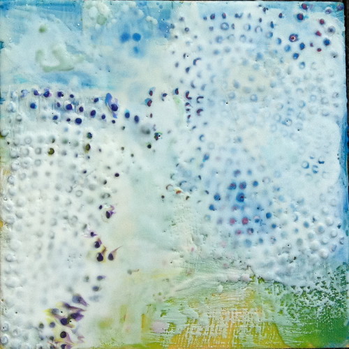
    Encaustic Abstract on cradled board

    Update 2016: Since moving and Jim not yet having a workshop set up I've been buying panels from Jacksons.

    Incidentally if you are a new customer Jacksons will give you a 10% discount!

    Sunday, October 23, 2011

    One year on...

    Wax before scraping back...


    I am currently playing with encaustics - I'm taking Judy Wise's on-line course and making a huge mess in the basement!

    Encaustic medium Wax "Lollies"

    I finished my 365 of photos related to dream images in September:

    365 Dream Photos

    You can see all the images in this Flickr set.

    Then released from that - which was a wonderful project but did consume a lot of time - I bought an IR filter to use with my iPhone:

    Real and Fake IR

    And played with Carla Sonheim and her Silly drawing class:

    Play with the Lines + Colour Play with Lines Silly Abstract

    And clearly I've not been blogging!

    :)